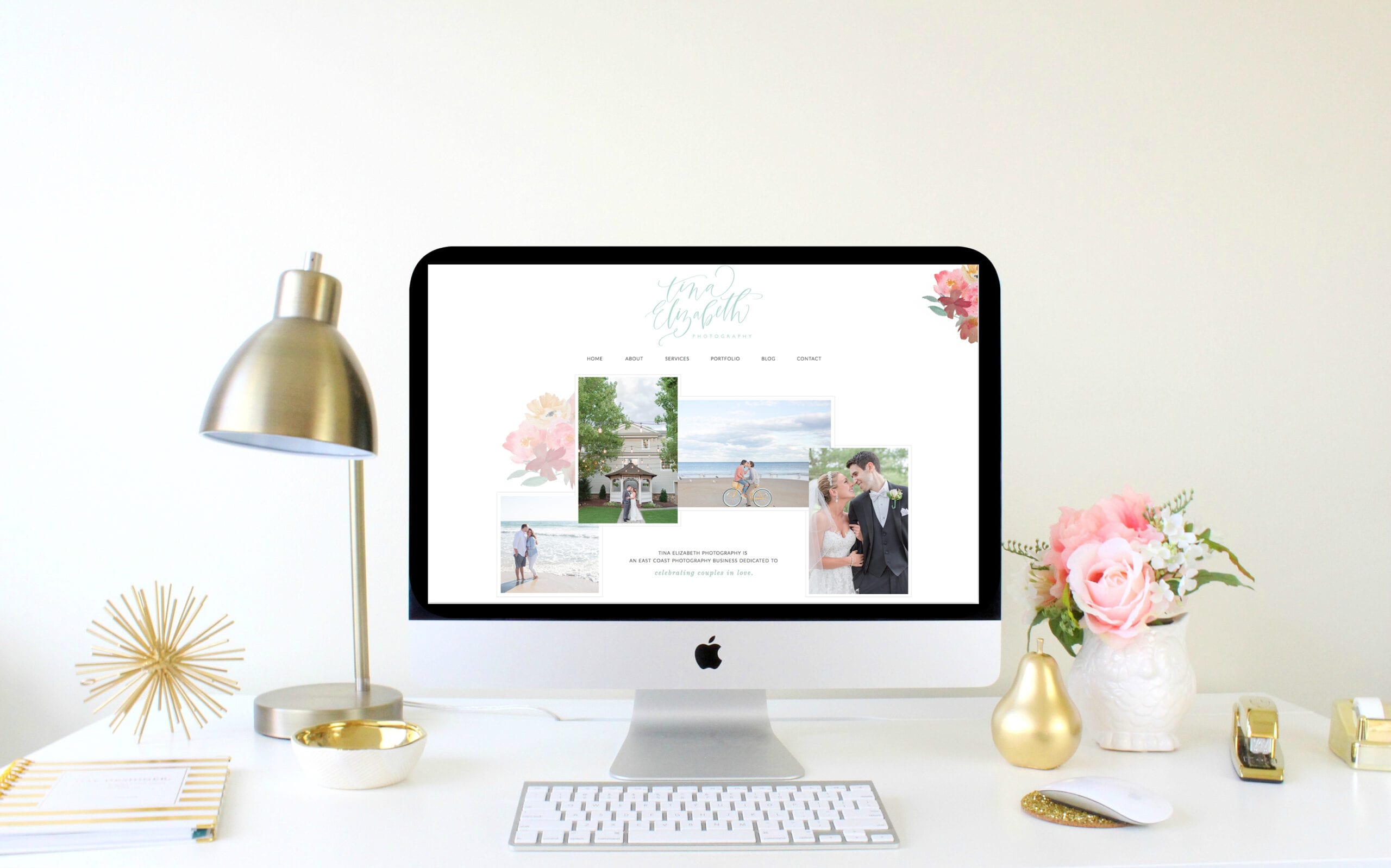
YAY!!!! The day is finally here – my brand new website and blog are live!! 🙂 I’ve been working on this since the New Year and I am SOOO excited to share this with you all today!! You know we will be popping champagne tonight!! 🙂
Over the past few months, I’ve been working with the AMAZING ladies of With Grace & Gold, Andra & Kelly, to create a refreshed new look for my website, blog, and brand! They truly are the BEST and I can not recommend enough. They gave me exactly what I have envisioned for my new look. Any weird requests I had about the website or brand wasn’t too weird for them and together, they created a brand I am now SO proud to call my own 🙂 I’m SO grateful to have found these girls!! Oh and one of my FAVORITE details is that little flower in the upper left corner of my website (and behind the photos on the home page). That was custom painted by my bride, Lauren!! I knew I wanted to keep flowers in my Brand and I wanted something different then what I had and immediately thought of Lauren, who obviously is amazing with watercolors. She happily created this gorgeous motif for me and I’m SO happy it’s now a part of my new look!! Not only is it on my website but you’ll find it on my new business & notecards 😉 Thank you again Lauren! Be sure to visit Lauren’s etsy shop – anything you can dream up, she can create it for you!
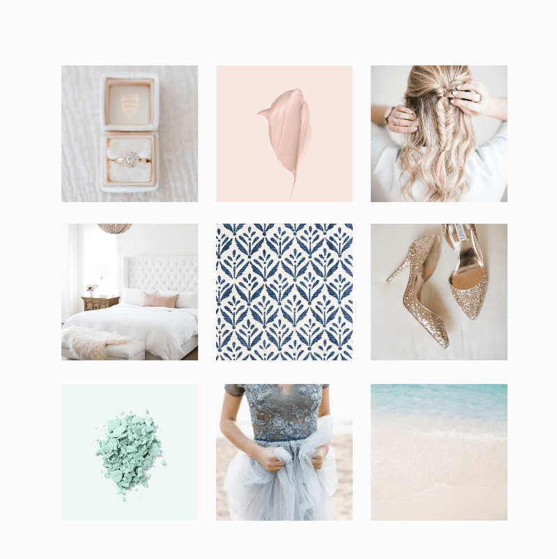
I have had my previous branding since I first started my business and while I LOVED it, I was definitely ready for a change! We kept the fundamentals of my brand (mint green, flowers, lots of color) but switched it up and made it look fresh, a little bit more romantic and a lot more colorful. What I really wanted was to create a happy home for my business, where clients can get to really know ME and what my business is about! Now my brand matches my business with a colorful, authentic and joyful aesthetic.

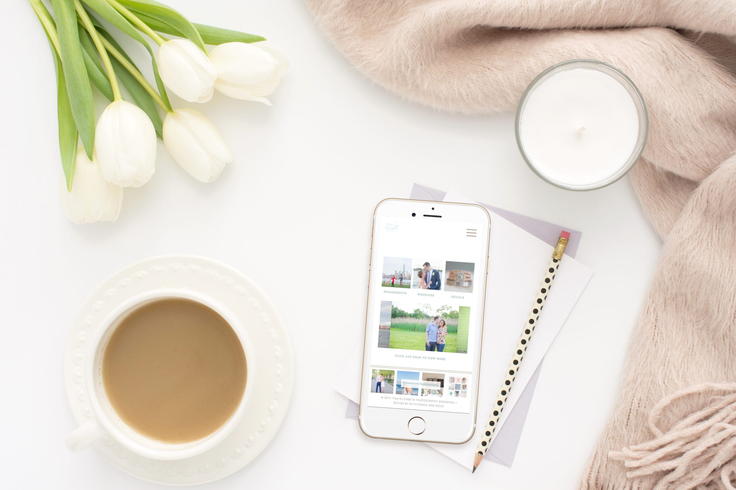
There are so many little parts about my new website I absolutely love. My hands down absolute FAVORITE thing about my new website is it is finally MOBILE FRIENDLY!! This is something I have not had this ENTIRE time I’ve been in business (is that crazy or what!?) That was my number one priority and not only do I now have that, but it’s just as gorgeous on your cell phone as it is on the desktop! It’s easy to get to know me better, easy to read my blog and it’s SUPER easy for future clients to contact me anywhere, anytime! YES!! 🙂

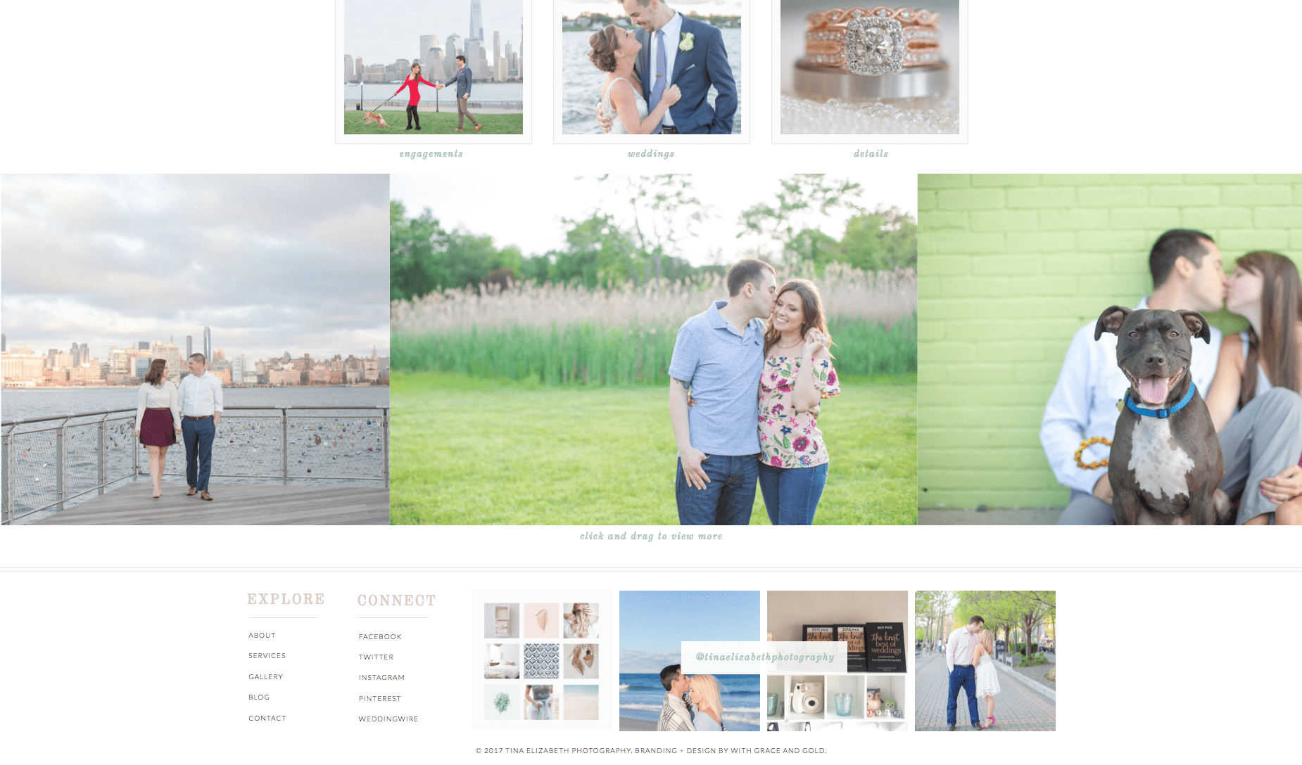
Besides finally being mobile friendly, my favorite part is seeing so many of my beautiful clients and their wedding days integrated right into the site! You can view my work browsing through my portfolio but you can also see my photos ANYWHERE on the website. They are in the headers on each page, the slides on the main page and even in the contact form. I love that! Plus, you can easily see all my social media at the bottom of the website and even my Instagram feed! I love this feature because not only am I obsessed with Instagram (who isn’t?) but so many of my TEP Brides are as well! Even on my website, we’re always connected 😉

That is a quick look around my website but don’t take my word for it, go and wander around it yourself!! One of my FAVORITE parts of the website is the about page, with a section all about the things I love that truly bring me joy, outside of photography!
In honor of the new brand and website, I am doing a GIVEAWAY!! 🙂 YAY! You might see this coming but I’m giving away a $50 gift card to KATE SPADE!! Oh, you know I just LOVE me some Kate Spade and I know so many of my Brides do too so this is just the perfect giveaway. All you have to do to enter the giveaway is simply leave a comment on this blog post! 🙂 I will announce the winner of the gift card this Friday, March 17th, on Instagram! Tell your fiances and husbands to comment too – because if they win, YOU win! 😉 **CONTEST IS OVER. CONGRATULATIONS TO TIFFANY, THE WINNER OF THE $50 KATE SPADE GIFT CARD! 🙂
And that’s it! Thank you SO much for celebrating my launch with me today and I’m SO excited for what’s next! 🙂
add a comment
+ COMMENTS